This is the third blog post in the “Teaching the Tidyverse in 2020” series. The first post was on getting started, the second on data visualisation, and today our focus is data wrangling and tidying. In this post, I’ll highlight of the some new(ish) features of dplyr and tidyr. Over the past year there has been a lot of exciting updates to both of these packages and these updates are well documented in the tidyverse blog. My goal here is to highlight updates that apply to introductory data science or statistics curricula.
Throughout this post we’ll be using the tidyverse package, so let’s go ahead and load it.
library(tidyverse)
Reshaping data
A common task in data analysis is going from wide data (e.g. where repeated measurements on a subject are recorded in a single row across consecutive columns) to long data (where each measurement is represented as a row), or vice versa. We’ll stick with penguins in this post, but make up some (realistic) data that lends itself to reshaping from wide to long. Suppose we have 4 penguins in our sample, and we take measure the body mass of each penguin 3 times. We also record their names, sex, and whether they tap dance (yup, you heard that right!).
penguins_madeup_wide <- tribble(
  ~name,        ~sex,     ~tap_dance, ~body_mass_1, ~body_mass_2, ~body_mass_3,
  "Mumble",     "male",   TRUE,       4801,         5699,         5743,
  "Gloria",     "female", FALSE,      4785,         3092,         4220,
  "Memphis",    "male",   FALSE,      3349,         4186,         4454,
  "Norma Jean", "female", FALSE,      4235,         3220,         4019
)

penguins_madeup_wide
## # A tibble: 4 x 6
##   name       sex    tap_dance body_mass_1 body_mass_2 body_mass_3
##   <chr>      <chr>  <lgl>           <dbl>       <dbl>       <dbl>
## 1 Mumble     male   TRUE             4801        5699        5743
## 2 Gloria     female FALSE            4785        3092        4220
## 3 Memphis    male   FALSE            3349        4186        4454
## 4 Norma Jean female FALSE            4235        3220        4019
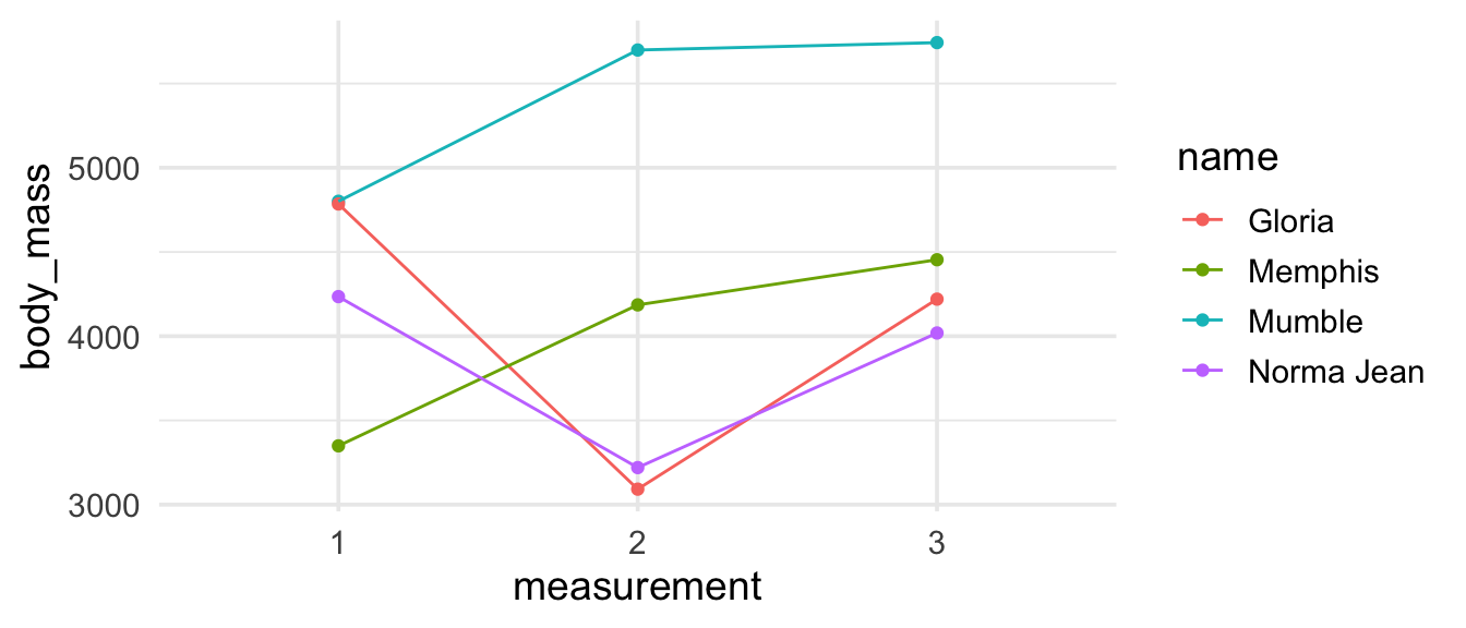
Now suppose we want to create the following visualisation.

To make this visualisation we need to get our data frame to look like the output shown below, where each point plotted corresponds to one row of the data frame and body mass measurements appear in a single column with a new columns (measurement) identifying which of the three measurements the record comes from.
## # A tibble: 12 x 5
##    name       sex    tap_dance measurement body_mass
##    <chr>      <chr>  <lgl>     <chr>           <dbl>
##  1 Mumble     male   TRUE      1                4801
##  2 Mumble     male   TRUE      2                5699
##  3 Mumble     male   TRUE      3                5743
##  4 Gloria     female FALSE     1                4785
##  5 Gloria     female FALSE     2                3092
##  6 Gloria     female FALSE     3                4220
##  7 Memphis    male   FALSE     1                3349
##  8 Memphis    male   FALSE     2                4186
##  9 Memphis    male   FALSE     3                4454
## 10 Norma Jean female FALSE     1                4235
## 11 Norma Jean female FALSE     2                3220
## 12 Norma Jean female FALSE     3                4019
Previously you might have approached this with the gather()/spread() functions. But there is a new pair of much more intuitive functions in town (i.e. in the tidyr package): pivot_wider() for going from longer to wider data and pivot_longer() for going from wider to longer data. The following animated visualisation by
Mara Averick does a fantastic job of visually explaining what we mean by pivoting the longer (or wider).

Before embarking in the code, it’s useful to ask questions about what the expected output will look like in terms or number of rows and columns, e.g. “If the long data will have a row for each penguin/measurement combination, and there are 4 penguins and 3 measurements for each, how many rows will the desired data frame have?". Having some expectation about what the output of a function will look like is good practice to instil in students.
In this case we want to go from a wider data frame (with more columns) to a longer data frame (with fewer columns, and more rows), so we will use the pivot_longer() function. We need to tell the function, at a minimum,
-
which columns to pivot: any column that starts with the character string
"body_mass", -
what the name of the new variable where we put the names of the variables that are being pivoted should go to:
names_to = "measurement", and -
what the name of the new variable where the values of the the variables that are being pivoted should go to:
values_to = "body_mass".
penguins_madeup_wide %>%
  pivot_longer(
    cols = starts_with("body_mass"),
    names_to = "measurement",
    values_to = "body_mass"
  )
## # A tibble: 12 x 5
##    name       sex    tap_dance measurement body_mass
##    <chr>      <chr>  <lgl>     <chr>           <dbl>
##  1 Mumble     male   TRUE      body_mass_1      4801
##  2 Mumble     male   TRUE      body_mass_2      5699
##  3 Mumble     male   TRUE      body_mass_3      5743
##  4 Gloria     female FALSE     body_mass_1      4785
##  5 Gloria     female FALSE     body_mass_2      3092
##  6 Gloria     female FALSE     body_mass_3      4220
##  7 Memphis    male   FALSE     body_mass_1      3349
##  8 Memphis    male   FALSE     body_mass_2      4186
##  9 Memphis    male   FALSE     body_mass_3      4454
## 10 Norma Jean female FALSE     body_mass_1      4235
## 11 Norma Jean female FALSE     body_mass_2      3220
## 12 Norma Jean female FALSE     body_mass_3      4019
This is looking pretty good! But remember that the measurement variable we had mapped to the x-axis of our visualisation had the values 1, 2, and 3 (not body_mass_1, body_mass_2, and body_mass_3). We could manipulate the measurement variable with a mutate() after pivoting to remove the character string "body_mass_" from its values, but the pivot_*() functions offer additional arguments to do this sort of manipulation task at the time of pivoting. The argument we need here is names_prefix, which takes a regular expression used to remove matching text from the start of each variable name. So, let’s try again with this argument added to our pivot_longer() call.
penguins_madeup_long <- penguins_madeup_wide %>%
  pivot_longer(
    cols = starts_with("body_mass"),
    names_to = "measurement",
    names_prefix = "body_mass_",
    values_to = "body_mass"
  )

penguins_madeup_long
## # A tibble: 12 x 5
##    name       sex    tap_dance measurement body_mass
##    <chr>      <chr>  <lgl>     <chr>           <dbl>
##  1 Mumble     male   TRUE      1                4801
##  2 Mumble     male   TRUE      2                5699
##  3 Mumble     male   TRUE      3                5743
##  4 Gloria     female FALSE     1                4785
##  5 Gloria     female FALSE     2                3092
##  6 Gloria     female FALSE     3                4220
##  7 Memphis    male   FALSE     1                3349
##  8 Memphis    male   FALSE     2                4186
##  9 Memphis    male   FALSE     3                4454
## 10 Norma Jean female FALSE     1                4235
## 11 Norma Jean female FALSE     2                3220
## 12 Norma Jean female FALSE     3                4019
I think the best place to get started with the pivot_*() functions is the
pivoting vignette in the tidyr package. This vignette includes both simple examples for doing the bare minimum when pivoting and more extensive examples that use most or all of the arguments that the pivoting functions offer.
Now that we have the data in the shape we want, we can recreate our visualisation.
penguins_madeup_long %>%
  ggplot(aes(x = measurement, y = body_mass,
             group = name, color = name)) +
  geom_point() +
  geom_line()

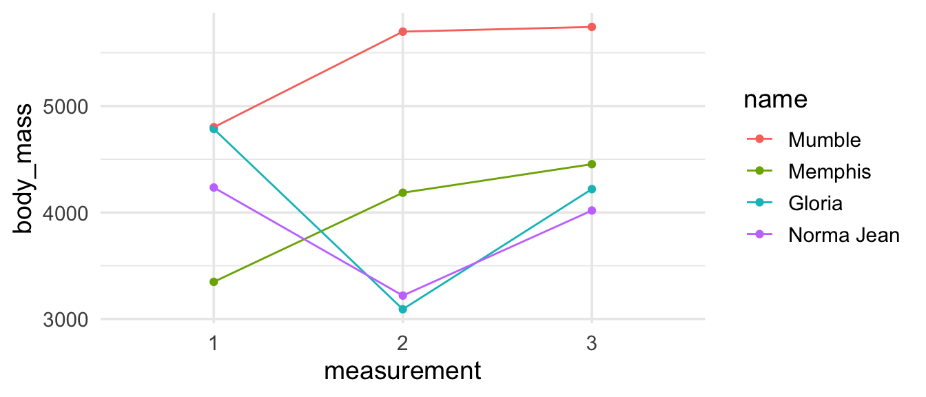
Looking good, though not ideal… Remember
the tip from the previous post in the series about reordering your legend in the same order as the data appears on your plot using fct_reorder2()? It would be a useful addition here.
penguins_madeup_long %>%
  mutate(name = fct_reorder2(name, measurement, body_mass)) %>%
  ggplot(aes(x = measurement, y = body_mass,
             group = name, color = name)) +
  geom_point() +
  geom_line()

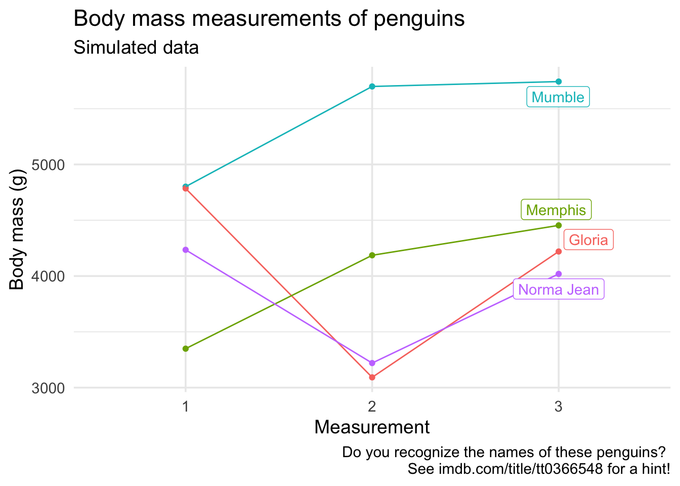
If you wanted to get really fancy, you can do directly label the lines with the the geom_label_repel() function from the
ggrepel package. Since we only want the third measurement to be labeled, we can filter the data for that measurement and label the points with the names of penguins. While we’re at it, let’s fix up all the other labels in the plot as well.
library(ggrepel)

ggplot(penguins_madeup_long,
       aes(x = measurement, y = body_mass, group = name, color = name)) +
  geom_point() +
  geom_line() +
  guides(color = FALSE) +
  geom_label_repel(data = penguins_madeup_long %>% filter(measurement == 3),
                   aes(label = name)) +
  labs(
    x = "Measurement",
    y = "Body mass (g)",
    title = "Body mass measurements of penguins",
    subtitle = "Simulated data",
    caption = "Do you recognize the names of these penguins?
    See imdb.com/title/tt0366548 for a hint!"
  )

This has quickly turned into a lesson on data visualisation, and that is a good lesson in and of itself – if you start teaching R and data science with data visualisation, which is the starting point I strongly recommend, you shouldn’t feel like you need to cover all of data visualisation before you can move on to the next topic. Often times getting your data visualisation to look a certain way is a great motivator for data wrangling and reshaping, which means that after an initial introduction to plotting basics, your data visualisation and wrangling lessons can be intertwined for a more problem-based approach to teaching.
Column-wise operations
Let’s revisit our wide penguin measurements dataset.
penguins_madeup_wide
## # A tibble: 4 x 6
##   name       sex    tap_dance body_mass_1 body_mass_2 body_mass_3
##   <chr>      <chr>  <lgl>           <dbl>       <dbl>       <dbl>
## 1 Mumble     male   TRUE             4801        5699        5743
## 2 Gloria     female FALSE            4785        3092        4220
## 3 Memphis    male   FALSE            3349        4186        4454
## 4 Norma Jean female FALSE            4235        3220        4019
Suppose you want to find the average body mass for each measurement. You can do this with dplyr::summarise(), once per each measurement.
penguins_madeup_wide %>%
  summarise(
    body_mass_1_avg = mean(body_mass_1),
    body_mass_2_avg = mean(body_mass_2),
    body_mass_3_avg = mean(body_mass_3)
  )
## # A tibble: 1 x 3
##   body_mass_1_avg body_mass_2_avg body_mass_3_avg
##             <dbl>           <dbl>           <dbl>
## 1           4292.           4049.            4609
But that’s quite tedious, especially if you had many columns you wanted to operate on. A new addition to dplyr is the across() function which makes it easy to apply the same transformation to multiple columns, allowing you to use select()semantics (e.g. starts_with(), contains()) inside summarise() and mutate().
penguins_madeup_wide %>%
  summarise(across(starts_with("body_mass"), mean))
## # A tibble: 1 x 3
##   body_mass_1 body_mass_2 body_mass_3
##         <dbl>       <dbl>       <dbl>
## 1       4292.       4049.        4609
A common task in data exploration is finding means and standard deviations for many columns at once. You can use summarise() along with across() to calculate multiple summary statistics at once as well.
penguins_madeup_wide %>%
  summarise(
    sample_mean = across(starts_with("body_mass"), mean),
    sample_sd   = across(starts_with("body_mass"), sd),
    )
## # A tibble: 1 x 2
##   sample_mean$bod… $body_mass_2 $body_mass_3 sample_sd$body_… $body_mass_2
##              <dbl>        <dbl>        <dbl>            <dbl>        <dbl>
## 1            4292.        4049.         4609             682.        1203.
## # … with 1 more variable: $body_mass_3 <dbl>
Note that I named my summary statistics with the prefix sample_ to distinguish them from the functions mean and sd. I think avoiding names that are also functions is useful for new learners, it helps them distinguish what is user input vs. what is R syntax. Unfortunately, sometimes this results in longer than desirable output.
While the code above makes it very explicit that you’re calculating two summary statistics, it is a bit repetitive and would look quite cluttered if you had to calculate many more summary statistics. Instead, you can give the functions to be applied across the columns as a named list.
penguins_madeup_wide %>%
  summarise(across(
    starts_with("body_mass"),
    list(sample_mean = mean, sample_sd = sd)
  ))
## # A tibble: 1 x 6
##   body_mass_1_sam… body_mass_1_sam… body_mass_2_sam… body_mass_2_sam…
##              <dbl>            <dbl>            <dbl>            <dbl>
## 1            4292.             682.            4049.            1203.
## # … with 2 more variables: body_mass_3_sample_mean <dbl>,
## #   body_mass_3_sample_sd <dbl>
A nice data wrangling exercise to give students at this point would be to reshape this output to look like the following.
## # A tibble: 3 x 3
##   measurement sample_mean sample_sd
##   <chr>             <dbl>     <dbl>
## 1 1                 4292.      682.
## 2 2                 4049.     1203.
## 3 3                 4609       777.
You can also use across() along with mutate(). Remember that name and sex variables were characters. Suppose we want to convert both of them to factors.
penguins_madeup_wide %>%
  mutate(across(where(is.character), as.factor))
## # A tibble: 4 x 6
##   name       sex    tap_dance body_mass_1 body_mass_2 body_mass_3
##   <fct>      <fct>  <lgl>           <dbl>       <dbl>       <dbl>
## 1 Mumble     male   TRUE             4801        5699        5743
## 2 Gloria     female FALSE            4785        3092        4220
## 3 Memphis    male   FALSE            3349        4186        4454
## 4 Norma Jean female FALSE            4235        3220        4019
Note that across() supersedes the family of scoped variants like summarise_if(), mutate_if(), summarise_all(), etc. While these functions will continue to be supported, if you are teaching data wrangling in 2020, it’s best to feature across() instead. You can learn more about across() and column-wise operations with dyplyr in general in the
column-wise operations vignette.
Row-wise operations
A common data preparation task where multiple measurements have been taken on a subject is averaging these measurements. In the example we’ve been working with, this would mean averaging the three body mass measurements for each penguin and reporting this as an additional column in the data frame.
penguins_madeup_wide
## # A tibble: 4 x 6
##   name       sex    tap_dance body_mass_1 body_mass_2 body_mass_3
##   <chr>      <chr>  <lgl>           <dbl>       <dbl>       <dbl>
## 1 Mumble     male   TRUE             4801        5699        5743
## 2 Gloria     female FALSE            4785        3092        4220
## 3 Memphis    male   FALSE            3349        4186        4454
## 4 Norma Jean female FALSE            4235        3220        4019
There are
many ways of accomplishing this task in R, but the one that I think is the most intuitive is using the rowwise() and c_across() functions in dplyr.
penguins_madeup_wide <- penguins_madeup_wide %>%
  rowwise() %>%
  mutate(body_mass_avg = mean(c_across(starts_with("body_mass"))))

penguins_madeup_wide
## # A tibble: 4 x 7
## # Rowwise:
##   name       sex    tap_dance body_mass_1 body_mass_2 body_mass_3 body_mass_avg
##   <chr>      <chr>  <lgl>           <dbl>       <dbl>       <dbl>         <dbl>
## 1 Mumble     male   TRUE             4801        5699        5743         5414.
## 2 Gloria     female FALSE            4785        3092        4220         4032.
## 3 Memphis    male   FALSE            3349        4186        4454         3996.
## 4 Norma Jean female FALSE            4235        3220        4019         3825.
There are other ways of finding row means in R, e.g. rowMeans(), but one nice aspect of this approach is that it’s extensible to any function, e.g. let’s find row medians instead of row means.
penguins_madeup_wide %>%
  rowwise() %>%
  mutate(body_mass_median = median(c_across(starts_with("body_mass"))))
## # A tibble: 4 x 8
## # Rowwise:
##   name  sex   tap_dance body_mass_1 body_mass_2 body_mass_3 body_mass_avg
##   <chr> <chr> <lgl>           <dbl>       <dbl>       <dbl>         <dbl>
## 1 Mumb… male  TRUE             4801        5699        5743         5414.
## 2 Glor… fema… FALSE            4785        3092        4220         4032.
## 3 Memp… male  FALSE            3349        4186        4454         3996.
## 4 Norm… fema… FALSE            4235        3220        4019         3825.
## # … with 1 more variable: body_mass_median <dbl>
You can learn more about rowwise() and row-wise operations with dyplyr in general in the
row-wise operations vignette.
Grouped summaries
One of the most attractive features of dplyr is easily obtaining grouped summaries by chaining together group_by() and then summarise(). Let’s use this workflow to calculate average body masses by sex and by whether or not the penguin tap dances (ok, this is not going to make sense if you haven’t seen
Happy Feet).
penguins_madeup_wide %>%
  group_by(sex, tap_dance) %>%
  summarise(avg_bm = mean(body_mass_avg))
## `summarise()` regrouping output by 'sex' (override with `.groups` argument)
## # A tibble: 3 x 3
## # Groups:   sex [2]
##   sex    tap_dance avg_bm
##   <chr>  <lgl>      <dbl>
## 1 female FALSE      3928.
## 2 male   FALSE      3996.
## 3 male   TRUE       5414.
There is nothing new in this code, but the message "summarise() regrouping output by sex (override with .groups argument)" is new, so you might have code in your teaching materials that didn’t produce this message before that now does. If you carefully look at the output you will see that the data are still grouped by sex. This behaviour has not changed, but previously wasn’t highlighted with a message, which often caused confusion for users. If you want to turn off the message, you need to decide on grouping behaviour and explicitly state this decision in a new argument in summarise(): .groups. Your options are "drop_last" (drop last level of grouping, default behaviour), "drop" (all groups are dropped), "keep" (keep grouping same as the input data for the function), "rowwise" (make each row its own group). For example, if you don’t want your data to be grouped at the end of this pipeline, you would used the "drop" option.
penguins_madeup_wide %>%
  group_by(sex, tap_dance) %>%
  summarise(avg_bm = mean(body_mass_avg), .groups = "drop")
## # A tibble: 3 x 3
##   sex    tap_dance avg_bm
##   <chr>  <lgl>      <dbl>
## 1 female FALSE      3928.
## 2 male   FALSE      3996.
## 3 male   TRUE       5414.
To learn more about this behaviour and the reasoning behind the changes, see here. If you are teaching new R users, I don’t think there is a good reason to go into the history of the message, and hopefully this message will steer new learners to be deliberate about how they use groups, as opposed to stumble into results without intentional grouping.
That’s all I have on teaching data wrangling and tidying in 2020. We have one post left in the series: “When to purr?” 🐈.
